My task
consisted of me producing a promotional package for an existing song. The song
I chose was ‘Bring Me To Life – Evanescence.’ In order to create a successful
and accurate music video, I undertook a lot of planning and research and when
finished my final piece, uploaded it to Youtube.com. Part of my brief was to
create a six panel digipak and a magazine advertisement for my chosen song. I
will evaluate and analyse my media products on the effectiveness of the use of
conventions, how the products work cohesively and the use of digital media
during my research and planning stages as well as the actual filming and
editing stages. I will also comment on the use of my audience feedback and how
it helped and didn’t.
In order to create an accurate product, I knew I had to incorporate the micro technical elements such as mise-en-scene, cinematography, editing and sound. I decided to dress the female protagonist in a white dress to imply to the audience ideas of a ghost like figure. I noticed in the original music video by Evanescence that Amy Lee is also dressed in a white dress, therefore I saw this as a convention of the alternative rock and punk genre.I decided to use an extreme close up of my female protagonist in order to illustrate feelings of sorrow and depression that the female protagonist has. This creates feelings of uncertainty for the audience as they feel that the female protagonist is unstable; this is what I wanted to achieve and therefore through the use of cinematography, have achieved this accurately. When the song begins to ramp up to the chorus ("call my name and save me from the dark"), I decided to edit the music video to the beat of the song, therefore meaning that the editing would have to sped up in order to keep pace with the song. By editing to the beat this creates an accurate music video to match the pace of the song itself.
‘Bring Me To
Life’ starts off with a slow beginning yet speeds up towards the climax of the
song. Amy Lee (lead singer of Evanescence) initially wrote the song with
inspiration as such: waking up to the things which are missing in your life.
However when analysing the lyrics, I felt there was a semantic field of drugs
and reincarnation. The music video consists of Amy Lee wearing a nightgown
inside a tall building. She is dreaming of falling through the air from the top
of the sky scraper she is in. It is evident she is dreaming due to the end shot
of Lee fast asleep in her bed (which was the first establishing shot for the
music video). The band (and Paul McCoy) feature in the music video too as McCoy
tries to save Lee from falling off the building’s window ledge, however, he is
unsuccessful. Paul McCoy (from the band 12 Stone) is a featuring artist within
this song. I think it is ideal to feature the artist within the music video as
this allows the audience to understand the personality of the particular
artist.
I followed
certain mise-en-scene elements of the original music video. For example, I made
the choice for my female protagonist to wear a white dress. The idea of the
white dress is to illustrate to the audience that the female protagonist is
lost in herself therefore portraying a ghostly effect.
I also
followed aspects of the real music video by including shots of my band members
performing altogether. By including band members in my music video, this
creates an element of realism for the audience.
Within my
music video, I used a wide range of conventions to make my final product look
as professional as possible. In my genre research (see Genre Research 28.09.14)
I stated that it is important to follow the conventions of a particular genre,
in this case Alternative Rock and Punk. Alternative Rock and Punk consists of
including electric guitar, vocals, bass, drums and keyboards. Therefore by
including elements of band performance I am supporting this genre.
I have followed other elements of the
original music video in order to create a successful music video. For example,
at the beginning of the original music video, there is the use of a close up when
Lee is laid in bed. I have followed this convention by featuring a close up of
my female protagonist at the beginning of my music video.
I
have followed certain cinematography elements too. This is seen in the first
opening establishing shot that slowly zooms towards my female protagonist. This
also features in the original music video made by Evanescence when zooming in
from an extreme long shot to a close up of Lee laid in bed.
I decided to use medium close ups when portraying my band.
This is so the audience can view the expressions on the male protagonists face
at the time of their performance. I also chose to have the band members look
straight into the camera. This is so the audience feel as if they are directly
being spoken too. I chose for Hannah to look directly into the camera to so the
audience therefore feel a connection when Hannah begins to sing the lyrics.
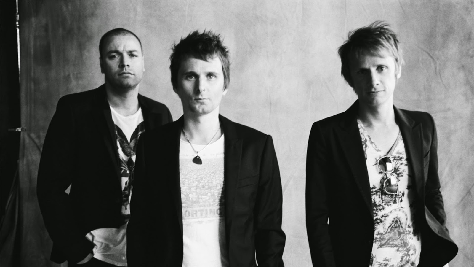
I have taken my main inspiration from the alternative rock
band Muse. I enjoy Muses music as well as their image. They portray a serious
image to their audience through their music as well as their image.

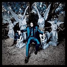
I have also taken key inspiration from the rock artist Jack
White. As well as Muse, I enjoy Jack’s music, image and his videos. I thought
Jack would be a great inspiration when creating my music video, digipak and
magazine advertisement. I followed Jack’s fashion sense and used this when
researching my digipak inspiration (see Digipak Inspiration: 06/02/14). Jack
began his career through the success of The White Stripes. For all of The White
Stripes albums, Meg (co-worker) and Jack followed the strict use of red, white
and black through all of their albums. This changed when Jack became a solo
artist in 2012 and he created a brand new image for himself. Jack changed to
using the colour scheme: blue, black and white for his most recent albums Blunderbuss and Lazaretto. I enjoyed the themes and the colour schemes of these
particular artists therefore I felt I would follow in inspiration. I used the
colour scheme black, blue and white to portray themes and ideas of loneliness
and isolation for my band (“Victims of the Euphoric”).

When it came to the
editing of my digipak, I kept in mind how Jack would create one. I used Jack as
my inspiration throughout the whole of the production of my products. I began
by creating a mock up digipak featuring images of Jack White. I did this for
many reasons, in particular to allow me to reinforce my skills on Photoshop as
well as to preview what a digipak would look like in the colour scheme and
style of Jack White. I liked this digipak however I felt like the colour scheme
was not as strong as I hoped it could have been. Therefore I took this into
account when creating my final digipak.
In
my music video, the most common editing techniques used are jump cutting as
well as cross dissolves. I have included cross dissolve (mostly at the beginning
of my piece) in order to match to the timing on the song. By using a cross
dissolve, this allows me to portray elegance and peace throughout my music
video until there is the use of the zoom.
I decided to use a fast zoom when transitioning from one
shot to another, when the beat begins to pick up. This is so I can maintain the
narrative whilst maintaining the beat of the music video. This style of editing
allows me to reinforce the narrative through the use of editing.
On my magazine advertisement, I have included all the
necessary conventions of an advertisement. This consists of:
- Barcode
- Release date
- Artist/album/song name
- Label logos
- QR Code
- Tracklist
- Where it is available to purchase
When creating my digipak, I made sure I had full logos, emblems
and copyright messages and information in order to protect my product. When
creating a cover for my actual CD’s, I had to research different music label
that I felt were relevant to my digipak and my artist. I researched the record
label that Evanescence are signed to which is ‘Wind-Up Records’. I thought this
record label would be highly relevant for my artist to be signed too. Although
it is convention to place the record label on the right of the CD, I have
placed at the bottom middle of my DVD. This is due to the fact that it was
difficult to understand when placed with a patterned background. On my CD, I
have placed the record label on the left of the CD; this is because it the
record label is easily readable and can easily be recognised by the audience.
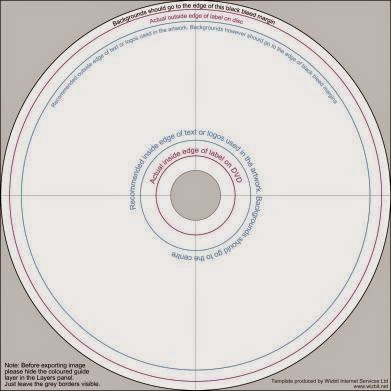
As this is the first time of creating my own CD, I was
unaware as to how I should set it out. I googled a template of a particular CD
however found no results. By looking on a previous blog (Lauren Mabbett) I
finally found a suitable template for my CD. This template allows me to arrange
what goes where on my CD. On the inside of my CD, I have placed the words ‘Copyright © 2015 Wind Up Records. All
Rights Reserved.’ This protects my song, music video and the actual CD from
becoming copied. I have also placed the words ‘2015 Wind Up Records Inc. Under exclusive license to Wind Up Records.
All Rights Reserved. Unauthorised copying, reproduction, hiring, lending,
public performance and broadcasting prohibited. Wind Up Records is the owner of
this product. Officially made in the EU LO00309 D00ECT0702’ This means that
this disk is protected from copyright and reproduction of this CD. It is
conventional to apply a paragraph like this is order to protect my disk.

When creating my track list, I was inspired by the ‘Fallen’ album initially produced by
Evanescence. I have kept all of the track names the same on the back of my
digipak in relation to the ‘Fallen’
track list.
When producing the front cover of my digipak, I had to
analysis the conventions that are required. I am aware that it needs to be an
eye catching image or design that will easily gain the audience’s attention. I
feel the front cover should represent the artist or the particular themes of
the album. I feel I have achieved this by using still images from my footage as
my front cover. This is beneficial for me as I avoided the problem of having to
recreate the diegesis again. I took inspiration from Jack White and used a
close up of Hannah. I have taken a screen shot of Hannah during a transition;
this is beneficial and looks really effective – especially when my aim was to
connote distorted ideas of loneliness and isolation.
I didn’t require a particular inspiration for the creation
of my magazine advertisement. I experimented with what I thought fit with my
ideologies best. I used the same image in which I used for the front cover of
my digipak. This is beneficial for the audience therefore they can easily
recognise who produced that album when having previously seen the magazine
advertisement.
‘Genre’ is a critical tool that helps us study texts and
audience responses to texts by dividing them into categories based on common
elements e.g. conventions. All genres have sub-genres.
David Bordwell (1989) stated that 'any theme may appear in any genre' therefore this illustrates the idea that genres are not fixed and adjust depending on the narrative. For example, Bordwell stated that horror films are basically just modern fairy tales. This is supported through my music video as the genre of my music video is preferably, closest to the horror genre. The narrative of my music video follows a young girl as she walks through a forest singing about losing herself to drugs. Young males are then introduced to the audience and they lip sync the male parts of 'Bring Me To Life'. My music video briefly follows the conventions of fairy tales as it finishes with a happy ending of my female protagonist actually coming to life. My music video also follows the idea that Bordwell presented: 'the duality of mans personal journey: conflict between a man's civilized side and his savage.' This is shown through the actions and lyrics of my female protagonist as she is fighting against herself trying to win a battle between life and death.
This links to the narrative approach that Claude Lévi Strauss created in 1958. He stated that ideas about narrative amount to the fact that all stories are operated by clear binary opposites. Life vs. death is the main binary opposite within the narrative of my music video as my female protagonist is fighting against herself for her right to live whereas the drugs are bringing her down and slowly killing her.
My music video challenges the views that Laura Mulvey set out to analyse. Mulvey stated that there are three approaches to how the audience view women, these are: how men look at women, how women look at themselves and how women look at other women. Mulvey also focuses on the portrayal of females and females bodies through the way the camera moves. She states that females are always seen as sexual objects throughout the media, this is evident in the "Blame" music video by Calvin Harris ft John Newman. Females are laid on a bed in their underwear therefore instantly are being portrayed as objects. I have challenged these conventions by dressing my female protagonist in an outfit that covers her whole body, therefore not being portrayed at a sexual object.


